Quantile Regression Analysis
by Sai Sri Maddirala, Jianing(Ari) Li, Yancy Castro
Hey Everyone!
TThis is Sai Sri, Ari, and Yancy! We want to be the voice that explains the concept of Quantile Regression. Hold on — it’s not as difficult as it sounds. We’ll help you figure it out.
Disclaimer: We spent a lot of time understanding this ourselves ,it’s actually easy once it clicks. No pressure (haha)!
Before that, let’s revisit our dear friend , the Regression model.To keep things simple and not overly technical, we used aKaggle dataset so it’s easer to explain.
This dataset deals with medical insurance charges. It explores how personal factors like age, BMI, gender, family size, and smoking habits, along with the region you live in, affect the cost of health insurance.
You might be wondering, why insurance, of all things? Well, let’s be real - you, me, and pretty much everyone else pays for it at some point, so we figured it’s something we can all painfully relate to. For this analysis, we focused on BMI, age, and smoking status, since these have the greatest effect on medical insurance charges.
Let’s first see what this regression depicts. Now, let’s dive into the Multiple Linear Regression model. —
What is Multiple Linear Regression?
Multiple Linear Regression is one of the most widely used statistical models. It estimates how several predictors work together to influence one outcome variable.
Our Model:
\[Insurance = \beta_0 + \beta_1 \cdot Age + \beta_2 \cdot BMI + \beta_3 \cdot Smoking + \varepsilon\]Where:
- $\beta_0$ = Intercept (baseline charges)
- $\beta_1$ = Age coefficient
- $\beta_2$ = BMI coefficient
- $\beta_3$ = Smoking coefficient
- $\varepsilon$ = Error term
Assumptions of MLR (Multiple Linear Regression):
-
Linearity: Each independent variable $X_i$ has a linear relationship with the dependent variable $Y$
-
Normality: The errors follow a Normal (Gaussian) distribution
-
Homoskedasticity: The errors have constant variance
-
Independence: The errors are independent of each other
Interactive 3D Visualization
In our 3D visualization, we focused on three main predictors: age, BMI, and smoking, and analyzed how they influence insurance charges. The blue plane represents non-smokers, while the red plane represents smokers.
The difference between the two planes is easy to see—the plane for smokers is higher than the one for non-smokers. Age and BMI both steadily increase the predicted charges, but smoking changes everything. From this 3D graph, it’s clear that smoking leads to higher medical costs.
Also, Say no to smoking !
With our trusty Python and libraries, we found that for every additional year of age, the average medical bill increases by $259 and each extra unit of BMI will add $323 to the insurance. But smoking? Whoa! Similar to what we saw in the graph, on average, smokers pay $23,824 more than non-smokers. This shows just how much influence smoking has on insurance charges.
Our prediction model gave us a mean prediction — in other words, the expected cost given these factors. But what if we want to know more than just the average? What if we want a deeper analysis, like how these costs vary among people in the lowest 25% of insurance charges (those who pay the least) or the highest 75% (those who pay the most)?
To solve these questions, here comes (drum roll…) our QUANTILE REGRESSION!!!
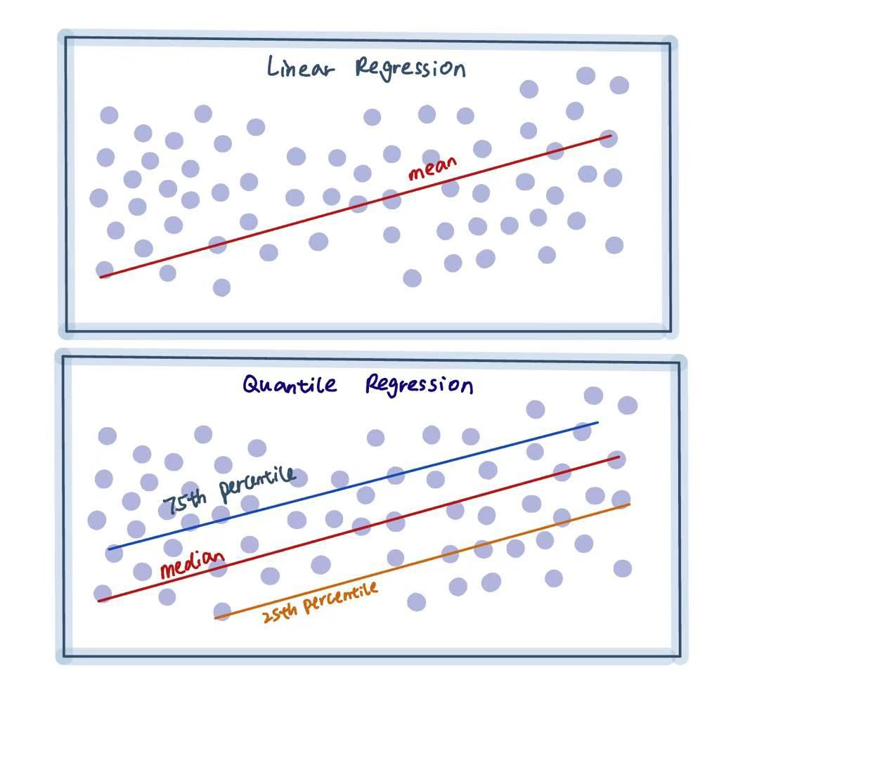
The image above shows, in the simplest way, the difference between Linear Regression and Quantile Regression.
Quantile Regression Analysis
Quantile regression does exactly what its name suggests. It is mainly used to estimate the distributional relationship between variables. Quantile regression can provide estimates for different quantiles, such as the 25th, 50th, and 75th percentiles.
This approach helps us understand how the effects of each predictor change across the entire range of insurance charges, not just the average!
The Math behind it
Generally, OLS(Ordinary Least Squares)minimizes the sum of squared residuals:
\[\hat{\theta}^{OLS} = \arg\min_{\theta} \sum_{i=1}^{n} (y_i - x_i^T \theta)^2\]This approach treats positive and negative errors equally both sides are penalized the same.
That’s why OLS gives us the mean line, where positive and negative residuals balance out to zero.
But in the case of Quantile Regression, the model is:
\[Q_Y(w | X) = X\theta_w\]and the estimator is found by minimizing the quantile (pinball) loss:
\[\hat{\theta}_w = \arg\min_{\theta} \sum_{i=1}^{n} \rho_w(y_i - x_i^T \theta)\]where the quantile loss function is:
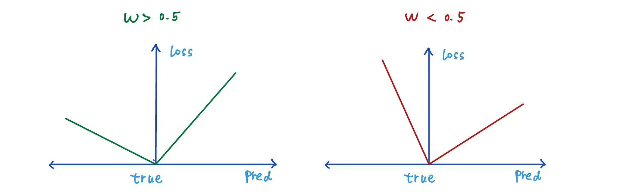
\[\rho_w(u) = \begin{cases} w \cdot u & \text{if } u \geq 0 \\ (w - 1) \cdot u & \text{if } u < 0 \end{cases}\]where:
- $y_i$ = Actual Observed value
- $x_i$ = Features (Independent Variables)
- $u$ = Residual (The Difference between actual and predicted value)
- $w$ = Quantile Level
- $\rho_w(u)$ = Quantile Loss Function (Also called as Pinball loss Function)
The above loss function is also known as quantile loss or pinball loss.
Key Insights:
-
When $w$ (quantile level) = 0.5, the line stays right in the middle, half of the points are above it, and half are below.
-
When $w$ (quantile level) > 0.5, the model pays more attention to the points above the line. As a result, the quantile regression line shifts upward, so a larger portion of the data lies below it.
-
Similarly, when $w$ < 0.5, the regression line moves downward, and fewer data points lie below it.
Using the Quantile Regression approach, we can build separate regression models for different quantiles to gain a deeper understanding of the data. For example, to obtain the 25th percentile model, we train the model with $w = 0.25$, and similarly for other percentiles.
Thanks to Python, its libraries, and amazing built-in functions, we were able to compute the Quantile Regression model and here’s how the graph looks!
Feel free to move the slider and see how changing the quantile shifts the planes. (Hint: focus more on the red smoker plane!)
The lower quantile shows how age, BMI, and smoking affect charges for people who pay less. The higher quantile shows how these same factors affect charges for people who pay more.
As we move the slider from the lower quantile to the higher quantile, we can see that the gap between the smoker and non-smoker planes starts small but gradually becomes much larger. Smoking doesn’t just add a fixed cost,it makes the increase in charges from age and BMI even greater, especially for people who already tend to have high medical expenses. This is one of the key insights that Quantile Regression can capture, but Multiple Linear Regression (MLR) cannot.
It was fascinating to see how people with the same age and BMI can have different insurance charges due to other factors. Quantile regression revealed this inequality by showing how the predictors influence costs at different percentiles.
Imagine being able to visualize different variables beyond the ones we’ve chosen — you’d get an even clearer picture of what Quantile Regression really is. Well, we’ve got you covered! We built a site that lets you experiment with different variables and responses so you can see firsthand how Quantile Regression changes based on your input.
Try it out: Interactive Quantile Regression App
Benefits of Quantile Regression
Not to brag, but Quantile Regression has a few advantages over MLR.
-
The errors are treated differently for positive and negative values, depending on the quantile level $w$.
-
Instead of giving just one regression line like MLR, it provides multiple lines or planes, one for each quantile, showing how the effect of the predictors changes at different levels.
-
MLR assumes that the errors have constant variance (homoscedastic), while quantile regression can also handle changing variance (heteroscedastic).
-
Quantile regression is also less sensitive to outliers because it uses absolute loss instead of squared loss.
-
Quantile regression works even when the data is skewed or not normally distributed.
Quantile regression is widely used in real-world applications, especially when we want to understand how predictors behave beyond the average. It is particularly useful in fields where extreme values or uneven data distributions matter , such as finance, where it helps predict financial risk; healthcare, where it helps study treatment effects across different patient groups; and environmental studies, among many others.
How to evaluate them?
- Quantile Loss (Pinball Loss):
where:
\[\rho_w(u) = \begin{cases} w \cdot u & \text{if } u \geq 0 \\ (w - 1) \cdot u & \text{if } u < 0 \end{cases}\]Lower values mean better performance for that quantile.
-
Pseudo R² (Koenker & Machado R²):
Koenker and Machado are the two statisticians who proposed this pseudo $R_{pseudo}^2$ that works for Quantile Regression, since the usual $R^2$ from OLS doesn’t apply here. This evaluation is similar to the $R^2$ that we did in MLR but this based on quantiles
Also, have a look at this if you want to know more about how the $R_{pseudo}^2$ works: Koenker & Machado (1999) - Inference for Quantile Regression
-
Coverage Probability :
This essentially shows how well the Quantile Regression model matches the actual distribution of the data. When a Quantile model is built for a certain quantile, it is expected to predict a line or plane where approximately quantile × 100% of the actual data points fall below it.
- I is an indicator function (which is =0 if true or false)
- $y_i$ = actual value
- $\hat{y}_i$ = predicted value from your quantile model
For a well calibrated model:\(\text{Coverage}(w) \approx w\)
Common Pitfalls and Mistakes
-
Ignoring measurement error in Dependent variable:
While quantile regression can handle random noise, it doesn’t properly account for systematic measurement errors. These errors can occur due to human mistakes, faulty sensors, rounding, and similar issues. Such errors cause severe bias in the coefficient estimates, leading to distortion in the model. As a result, all the quantile lines or planes get pulled toward the median, disrupting the actual data pattern and leading to incorrect interpretations.
-
Quantile Crossing:
In general, quantiles follow an order where the 25th percentile line stays below the 50th percentile, and the 75th percentile line stays above the 50th percentile. However, sometimes these lines cross each other, and the order changes. For example, the 25th percentile line can shift above the 50th percentile line. This is called Quantile Crossing. Quantile crossing breaks the logical order of quantiles and usually occurs when the model is too simple, the data has high noise or overlap, or when each quantile model is trained independently without any connection between them.
-
Convergence Problems: This problem mainly occurs when the data makes it difficult for the algorithm to find a stable and accurate solution. When I say the data makes it hard, it can be due to several reasons.
Some of them are:
-
The dataset is small and lacks enough variation. Estimating extreme quantiles with only a few data points makes it harder for the algorithm to converge.
-
Multicollinearity results in unstable coefficient estimates and makes it harder for the model to find accurate solutions.
-
Disadvantages of Quantile Regression
(Dont judge even smart models have their flaws)
-
Requires Large sample size:
Because Quantile Regression estimates quantiles ranging from low to very high percentiles, we need a large sample size to obtain reliable results. Smaller datasets have fewer data points in the tails, which increases uncertainty.
-
Computational complexity:
Quantile regression is computationally complex because it needs to solve each quantile through repeated calculations, which makes it slower and harder to scale for large datasets.
-
Inefficiency in High-Dimensional settings:
Quantile regression may become inefficient when dealing with very high-dimensional predictor spaces. Without appropriate regularization techniques, the model can become overly complex.
Topic Extension
Let’s bring everything together and look beyond. Ordinary Least Squares minimizes the average squared error to produce a single point estimate of $\hat{\beta}$. Since $\hat{y}$ is fixed, there’s no room for uncertainty.
For our insurance data: OLS: \(\text{Insurance} = -11{,}676.83 + 323 \times \text{BMI} + 259.55 \times \text{Age} + 23{,}823.68 \times \text{Smoker}\) This gives us a mean estimate and we accept it as a baseline.
Quantile Regression minimized a weighted absolute error. Each $\tau$ gives us one fixed quantile line $\hat{\beta}(\tau)$. But again, no expression of uncertainty.
Quantile Regression:
For high-cost patients in the 90th quantile, BMI has a stronger effect. At this point, we’ve moved beyond a single trend line to include multiple quantile estimates (for example, the 25% and 75% levels). Both OLS and Quantile Regression are deterministic, meaning they always produce the same estimates even when new data is added. This means we still don’t know how uncertain our estimates are. The magic of Bayesian Quantile Regression is that it transforms a deterministic process into a probabilistic one. It says, “Since we don’t know the true value of $\beta$, we should treat $\beta$ as a random variable!” This is where introducing our prior beliefs comes into play — and it also allows us to update those beliefs as we obtain more evidence.
Bayesian Quantile Regression:
-
Set our prior (before seeing the data): smokers have higher charges:
[ $\beta_{\text{smoker}} \sim \text{Normal}(5000, 2000^2)$ ]
-
When we see the actual data (Y, X), Bayes updates belief:
$P(\beta \mid X, Y) \propto P(Y \mid X, \beta) \, P(\beta)$
-
The visualizing the uncertainty meaning we sample the posterior draws to get posterior distribution mean and credible interval.
$p(\beta \mid X, Y, \tau)$
Finally we get the distribution that actually captures both trend and uncertainty.
Let’s wrap this up by thinking about the comparison. Quantile Regression expands linear regression by estimating several instead of one trend line, with each represents different quantile. It helps us better understanding how predictors affect different part of outcome that across quantile. Even though we don’t know how confident we are about the effects…
Bayesian Quantile Regression allows us to include prior or you can say domain knowledge. When combining prior with observed data, our prior updated to posterior. Bayesian Quantile Regression balances our prior belief with empirical evidence. At this stage, the result captures distributional difference across quantile. The uncertainty captured through posterior variance. We are finally gaining our confidence and the model interpretability. And this is the magic with Bayesian Quantile Regression.
Conclusion
Whoa! Finally! We know it’s a lot of information, but hey, we learned something new in depth!
Here’s what we learned:
Quantile Regression lets us see beyond traditional linear regression. From our insurance dataset, we found that smoking amplifies costs drastically. The impact of smoking isn’t uniform; it becomes more severe, which Multiple Linear Regression completely misses. Quantile Regression also works well when the data is skewed, has outliers, or shows heteroscedasticity. However, it’s not perfect, and we saw why.
We had a lot of fun writing this blog and researching the topic. They say, “What speaks to you, sticks to you.” This definitely stuck with us, and we hope it does the same for you.
Thank you for your time and patience.
We’d love to hear your thoughts, and if you’d like to chat more or nerd out about data, feel free to reach out to us on LinkedIn! Sai Sri Maddirala | Jianing (Ari) Li | Yancy Castro
References
-
Professor Cody’s lectures and notes - Course materials and guidance
-
Unraveling the Mysteries of Quantile Regression - Juan de la Calle (Medium)
-
Introduction to Quantile Regression - Daily Dose of Data Science
-
Errors in the Dependent Variable of Quantile Regression Models - MIT Economics Department
-
Koenker & Machado (1999) - Inference for Quantile Regression - University of Sydney